
EB CARDS
PROBLEM:
A colleague was launching a new trading card business, selling tabletop trading cards directly to collectors and players. They had a name (secretly an inside joke with their partner about Eggs Benedict), but they needed a brand.
SOLUTION:
A simple and bold visual identity that communicated cards sales in a fun but iconic way that stands apart in the sector. More friendly than the corporate Card Market and more neutral than the genre-based Manaleak or Darksphere. The colours were also a subtle reference to Eggs Benedict, but created a strong colourful image.
ROLE:
Creative Director, Designer




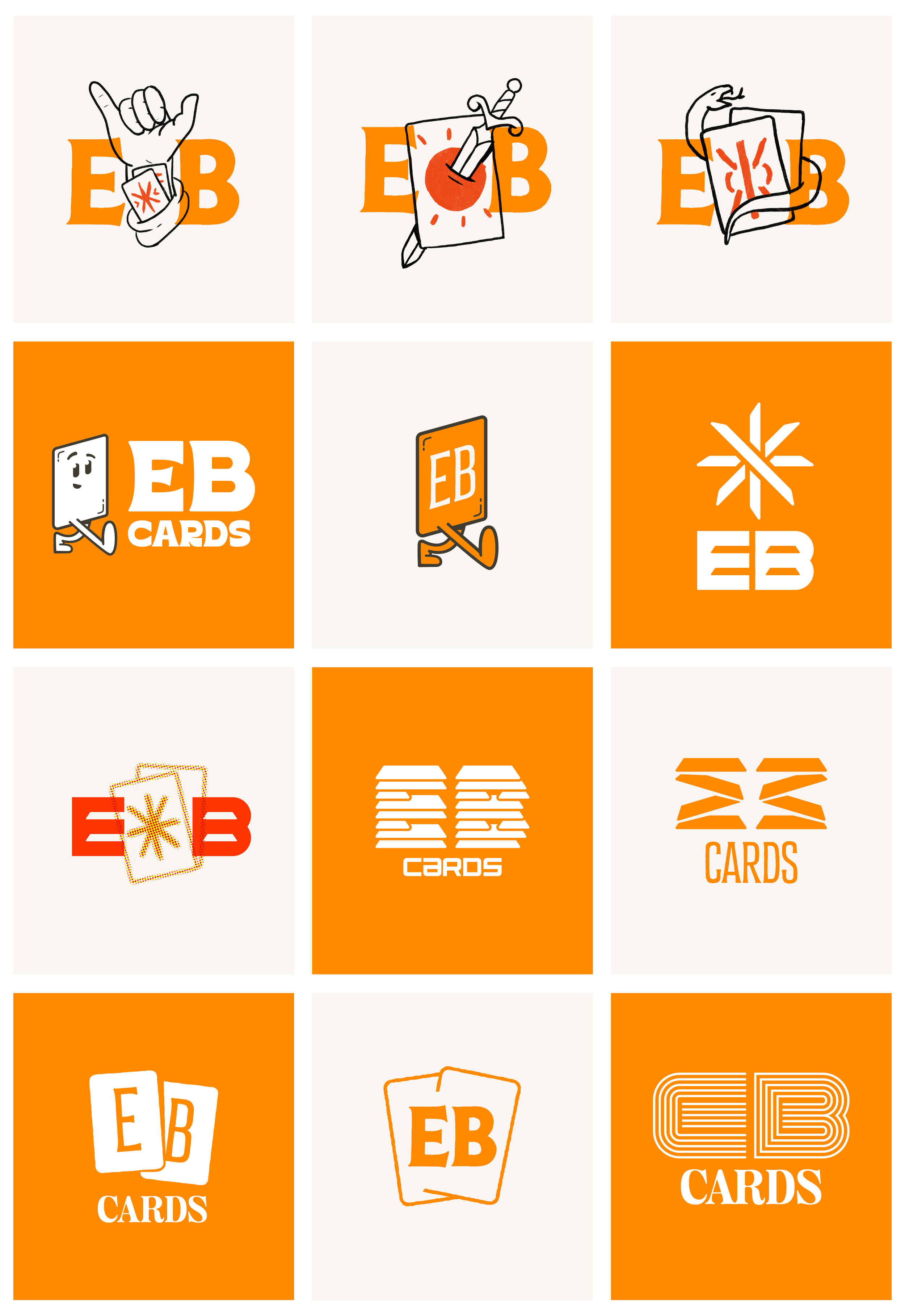
OTHER CONCEPTS
I had a lot of fun on this project exploring a range of directions which I felt were too good to leave in the sketchbook.