0
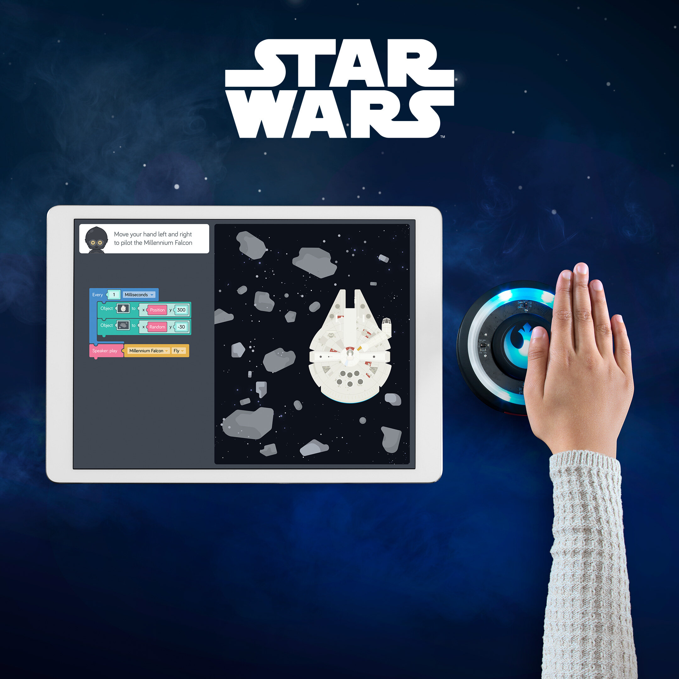
Star Wars Force Kit

0
DK LEGO Books

0
Harry Potter

0
King

0
Road 96

0
Wartales

0
Skype Magic

0
Hard-Fi

0
A Simples Guide

0
innocent kids
0
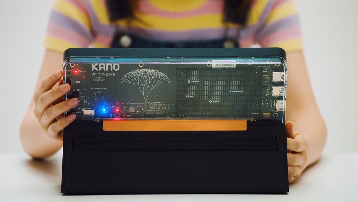
Kano PC
0
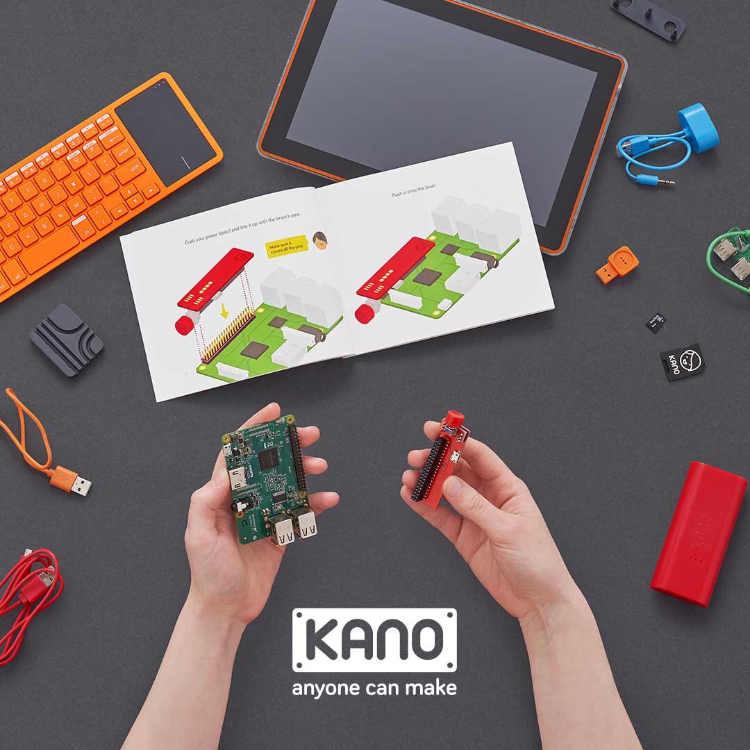
Kano

0
Molecule Mixer

0
Kano Social

0
Frozen 2 Coding Kit

0
Unum Backup Plan

0
Zoopla Smart Knows

0
Unum: Future Workplace

0
Armchair Experts

0
Lily's Kitchen

0
giffgaff Idents

0
What on Earth

0
Back British Basketball

0
MySpace

0
Engineered for speed

0
Skype Education

0
Original Stormtrooper
0
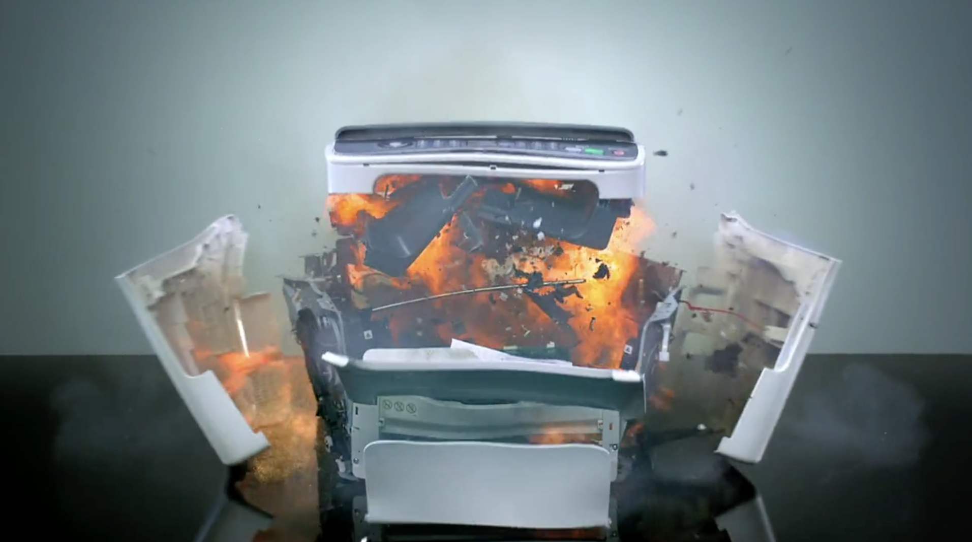
Professional Laser Killer

0
UKTV Strut

0
SeatView

0
Euros football

0
Stats Matter