

Stars of CCTV
PROBLEM:
Atlantic Records wanted to launch their new band Hard-Fi. But in a sea of indie bands they needed stand-out.
SOLUTION:
An iconic visual identity, and an award-winning album cover. One of the best album covers in the last 70 years.
ROLE:
Creative Director, Designer, Photographer


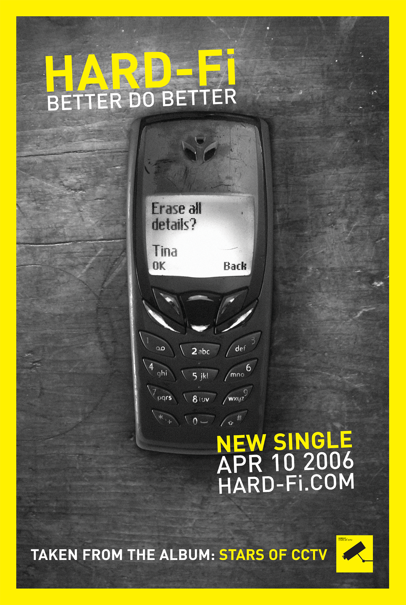
The singles
I was also the creative, photographer, and designer on each single. We created collectibility through subtle variations in the multiple formats. We also created a narrative across the sleeves starring an unknown women called Tina, to create intrigue. The press and fans were very interested to find out who she was.


The promos
Each one took a long time to write.