
IRREGULAR SHAPES
PROBLEM:
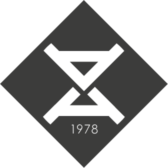
Whilst developing the naming and branding for City Tales, I noticed the Irregular Shapes brand looked overly fussing and wasn’t implemented well on their investment presentations. They needed to review the brand.
SOLUTION:
A new icon and logo that fed off the concept of the original Irregular Shapes logo, but simplified it. The shapes now formed an IS to create a more striking identity. The new proposal was immediately adopted across all of Irregular Shape’s touch points.
ROLE:
Creative Director, Designer


MORE ICONIC
The logo has a stronger presence on the key art.
