
PRELUDE: DARK PAIN
PROBLEM:
Developers QuickFire were getting feedback from potential investors that the UI design for their dark, medieval turn-based RPG didn’t fit with the rest of the game and it needed an overhaul.
SOLUTION:
I developed a new, more hand-painted UI design and rethought some of the UX to create a style that was simpler to use whilst feeling part of the universe QuickFire had created. I then applied the new approach across a huge host of screens and iconography.
ROLE:
Creative Director, UI Designer

A NEW MEDIEVAL STYLE:
Taking influence from the game’s artwork and medieval livery I developed a new style based on materials that felt a part of the game. For simplicity the game’s backgrounds have been removed in some screens below.


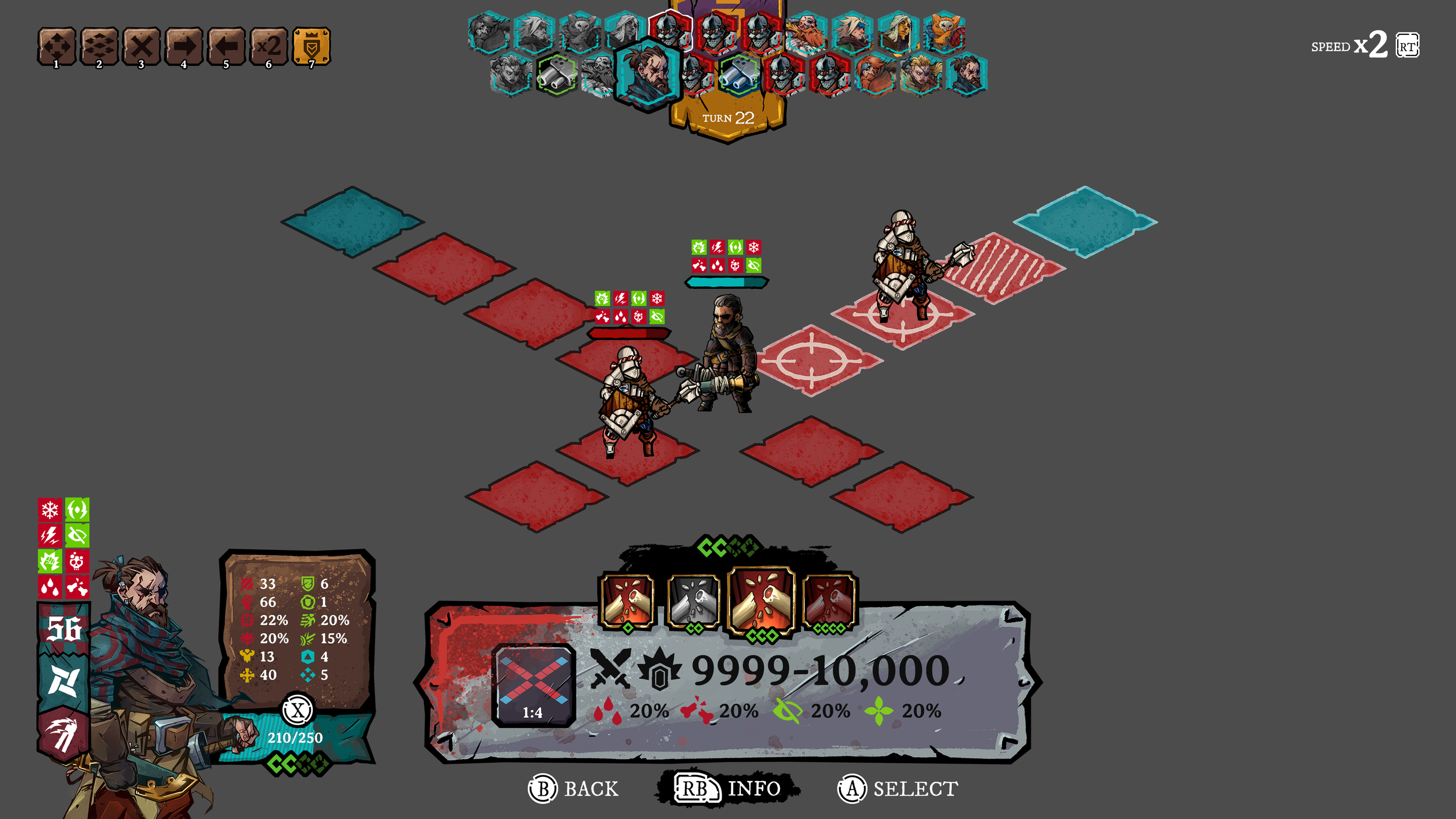


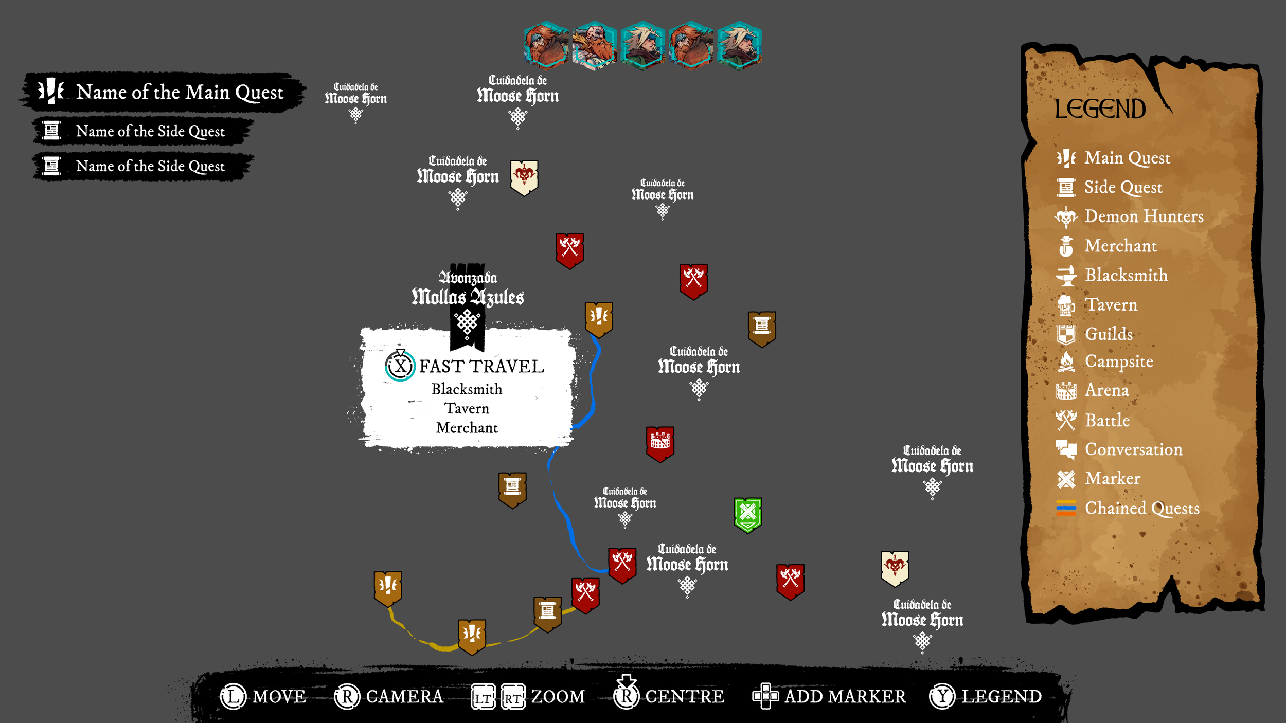


ICONOGRAPHY
I also developed and redesigned the iconography across the game bringing a consistency and hand-drawn touch.

